AI-generated image for illustrative purposes.
Ever notice how sometimes a cover hits harder than a thousand riffs? In the ’60s and ’70s, when vinyl was sacred ground, the artwork wrapped around the records wasn’t just decoration: it was manifesto, identity, provocation. Some of those images became as famous as the music inside — posters on teenage bedroom walls, symbols of rebellion on T-shirts, even pop culture icons that outlived their decades.
The Visual Revolution of the ’60s
Before psychedelia, album covers were pretty generic: band photo, polite smiles, basic typography, and done. But by the mid-decade, graphic art was hit head-on by the same creative explosion that shook music. Covers started to reflect counterculture, pop art, and psychedelia.
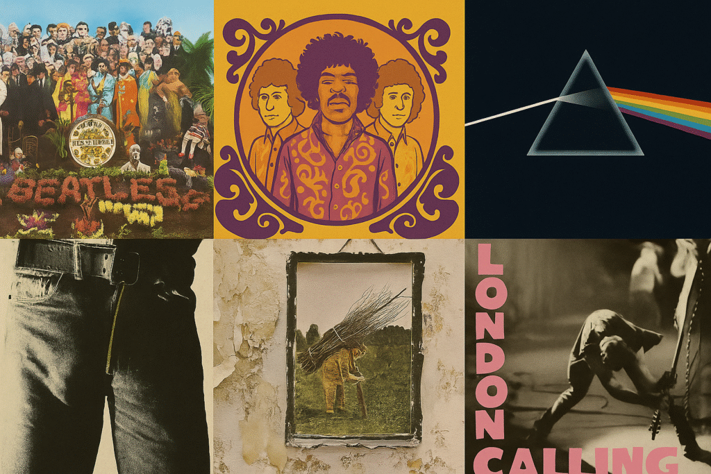
Sgt. Pepper’s Lonely Hearts Club Band – The Beatles (1967)
Nothing short of a watershed. Designed by Peter Blake and Jann Haworth, the cover assembled a crowd of personalities in one surreal portrait: from Bob Dylan to Karl Marx, from Marilyn Monroe to Oscar Wilde. Wax figures and colorful props turned the scene into a living collage. The provocation? Presenting the Beatles not just as musicians but as conductors of a cultural happening. It was shockingly expensive for its time, but it transformed the record into total art — so much so that Rolling Stone once crowned it the most iconic album cover in rock history.
Are You Experienced – The Jimi Hendrix Experience (1967)
Hendrix arrived as if from another dimension. Karl Ferris shot the band through a fisheye lens, bathed in saturated colors, to amplify the psychedelic trip. The distorted framing made Hendrix loom like a god, flanked by Noel Redding and Mitch Mitchell. More than a photo, it was a visual calling card announcing that this guitar was anything but conventional.
Sticky Fingers – The Rolling Stones (1971)
Born straight from ’60s daring, though released in the ’70s. Andy Warhol conceived the provocation: a tight pair of jeans with a real working zipper you could pull down. Inside: a shot of underwear. Far from gratuitous, the sexual provocation fit perfectly with the Stones’ bad-boy image. Graphic designer Craig Braun executed the project. The result? Scandal, censorship in some countries, and, of course, a marketing explosion that cemented the Stones’ “forbidden band” aura.
The ’70s: When the Cover Became a Manifesto
With counterculture matured, the next decade pushed album art to another level. It wasn’t just about catching eyes in the record shop; it was about translating the band’s sonic universe into image. Many covers became inseparable from the very music they contained.
The Dark Side of the Moon – Pink Floyd (1973)
Minimalist yet universal. Storm Thorgerson of Hipgnosis took the band’s request — something simple but powerful — and delivered the prism splitting light into a rainbow against a black void. A metaphor for Floyd’s sound: scientific, cosmic, yet deeply human. The cover became so popular it nearly turned into the group’s official logo. Even people who’ve never heard the record recognize that prism instantly.
Led Zeppelin IV – Led Zeppelin (1971)
Also known as the “untitled album,” because the band refused to put any name or logo on the sleeve. Instead, an enigmatic portrait of an old man carrying sticks, lifted from a painting found in an antique shop. On the back cover, the frame expands to reveal crumbling urban buildings — a stark clash of rural and industrial. The message was clear: let the music speak for itself. The sleeve became an act of resistance against commercial logic.
London Calling – The Clash (1979)
At the decade’s close, the Clash dropped a cover that captured punk’s raw fury in a single shot. Shot by Pennie Smith at New York’s Palladium, it shows Paul Simonon smashing his bass on stage. Smith thought it was too blurry; the band insisted. That imperfection carried the punk essence. The genius detail? The pink and green lettering, lifted from Elvis Presley’s debut LP. Punk, after all, was rebellion with roots.
More Than Covers: Eternal Icons
These images weren’t packaging. They shaped how we see music itself. Vinyl was ritual: pulling out the sleeve, smelling the paper, studying the art, dropping the needle. A sensory experience streaming will never replicate. Today, these covers hang in museums, fill coffee-table books, and live on as tattoos. Proof that rock always knew how to provoke not just the ears, but the eyes too.
Burning Questions
What was the first truly “revolutionary” album cover in rock?
Many point to the Beatles’ Sgt. Pepper’s as the watershed, though some see the Byrds and Jefferson Airplane’s early experiments as the real starting sparks.
Why did vinyl put so much weight on the cover?
Because the record was an object of worship: the artwork wasn’t just a shop window, it was part of the listening ritual.
Do iconic covers still exist today?
Yes, though streaming weakened the impact. Still, bands like Arctic Monkeys, Radiohead, and even Tool keep betting on striking visuals.
What happened to interactive covers?
In the ’70s, many bands played with foldouts, stickers, even working zippers like the Stones. Today, that’s a collector’s luxury, mostly limited to special editions.
— Lena Blaze, Rock Vaults
